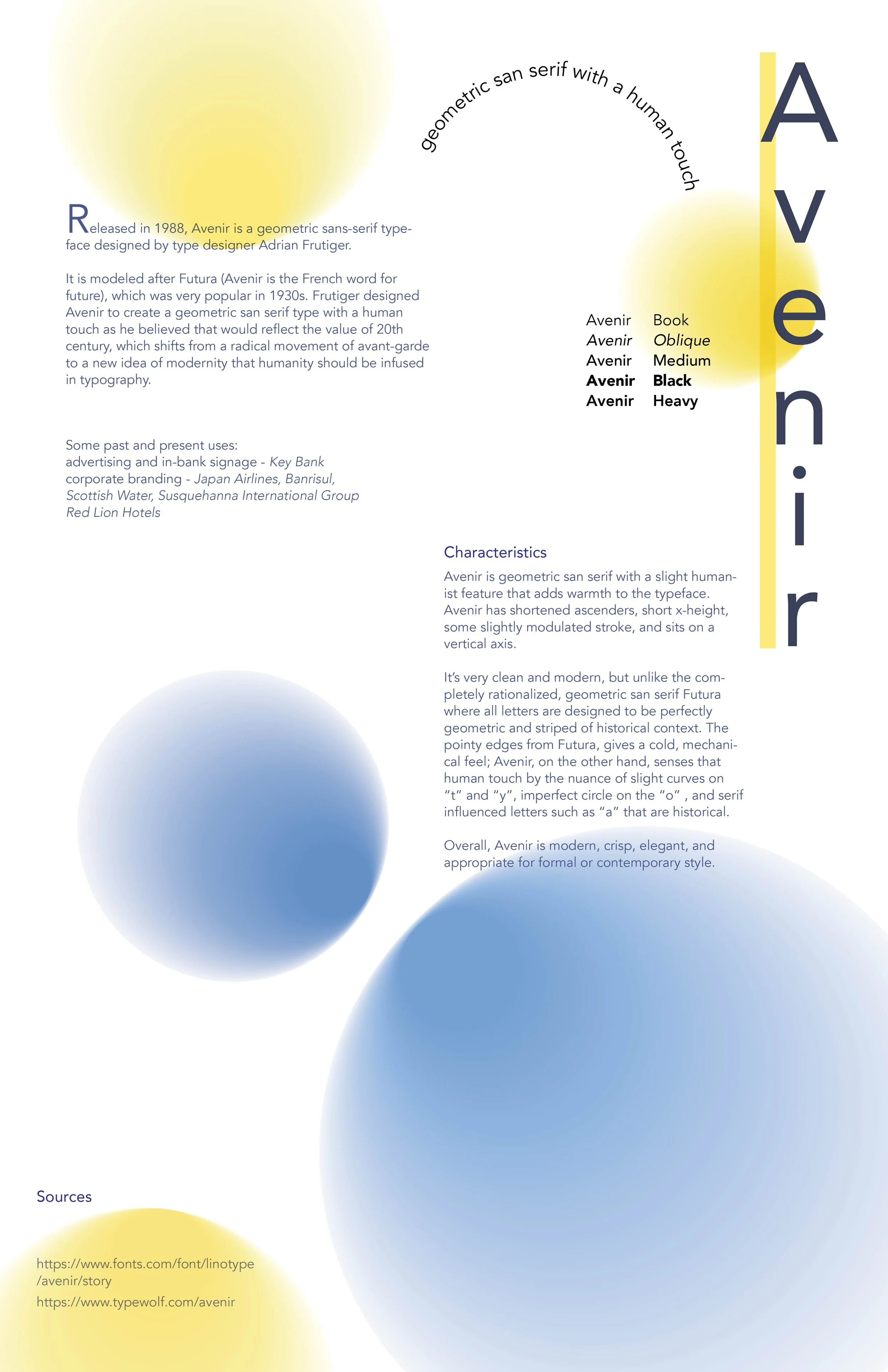
Avenir
Released in 1988, Avenir is a geometric sans-serif typeface designed by the type designer Adrian Frutiger.
Avenir is modeled after Futura (Avenir is the French word for future), which was very popular in the 1930s. Frutiger designed Avenir to create a geometric san serif type with a humanist touch as he believed it would reflect the value of the 20th century, which shifted from a radical idea of functionalist to a new modern idea, in which humanity should be embedded in typography.
Avenir is a geometric san serif with a slight humanist feature that adds warmth to the face. Avenir has shortened ascenders, some slightly modulated stroke, and sits on a vertical axis. It’s very clean and modern, but unlike the completely rationalized, geometric san serif Futura where all letters are designed to be perfectly geometric and stripped of historical context. The pointy edges from Futura give a cold, mechanical feel; Avenir, on the other hand, senses that human touch by the nuance of slight curves on “t” and “y”, imperfect circle on the “o” and serif influenced letters such as “a” that is historical.
Overall, Avenir is modern, crisp, elegant, and appropriate for formal or contemporary style.
Skill: typography
Tools: Illustrator, Indesign, Photoshop


Visual Voice
Bright, modern, expressive
Stability, modern, objective
Mockups
/ Shake up a peaceful minimalistic room with an outburst of energy and sophistication /
These posters add an addition of colors and exciting sensations to the interiors, giving a contrast/dimension to the interior design.
Avenir (“future” in French)
Designer - Adrian Frutiger
Classification - Geometric Sans-Serif
Adjectives - simplicity, transparency, modern


